Why illustration matters




In saturated markets, everyone can look good. Almost no one is memorable. That gap is where illustration does its work, not as decoration, but as the thing people actually remember.
Three reasons it matters:
1/3
Memorability
We remember pictures,
not paragraphs.
People scan past blocks of copy and lock onto what's visual. And what they see, they keep: we recall far more images than words, and recognize them with near-perfect accuracy days later.
Nielsen Norman Group (eye-tracking); picture superiority effect, Standing (1973).
2/3
Recognition
Distinctive visuals are a growth asset.
Icons, illustrations and visual codes are what let people notice, recognize and recall a brand. Marketing science treats these as distinctive brand assets — a measurable driver of growth, not a cosmetic layer.
source: Ehrenberg-Bass Institute — Romaniuk, Building Distinctive Brand Assets.
3/3
Consistency
A system outlasts a single illustration.
Distinctive assets are built over time and only work through consistent use. That's why I build visual systems, not one-off pieces — coherent languages a brand can own for years, across every surface.
Source: Ehrenberg-Bass Institute.
How it works in practice
Illustration systems that scale
A brand doesn't need one good illustration. It needs a hundred that look like they came from the same hand.
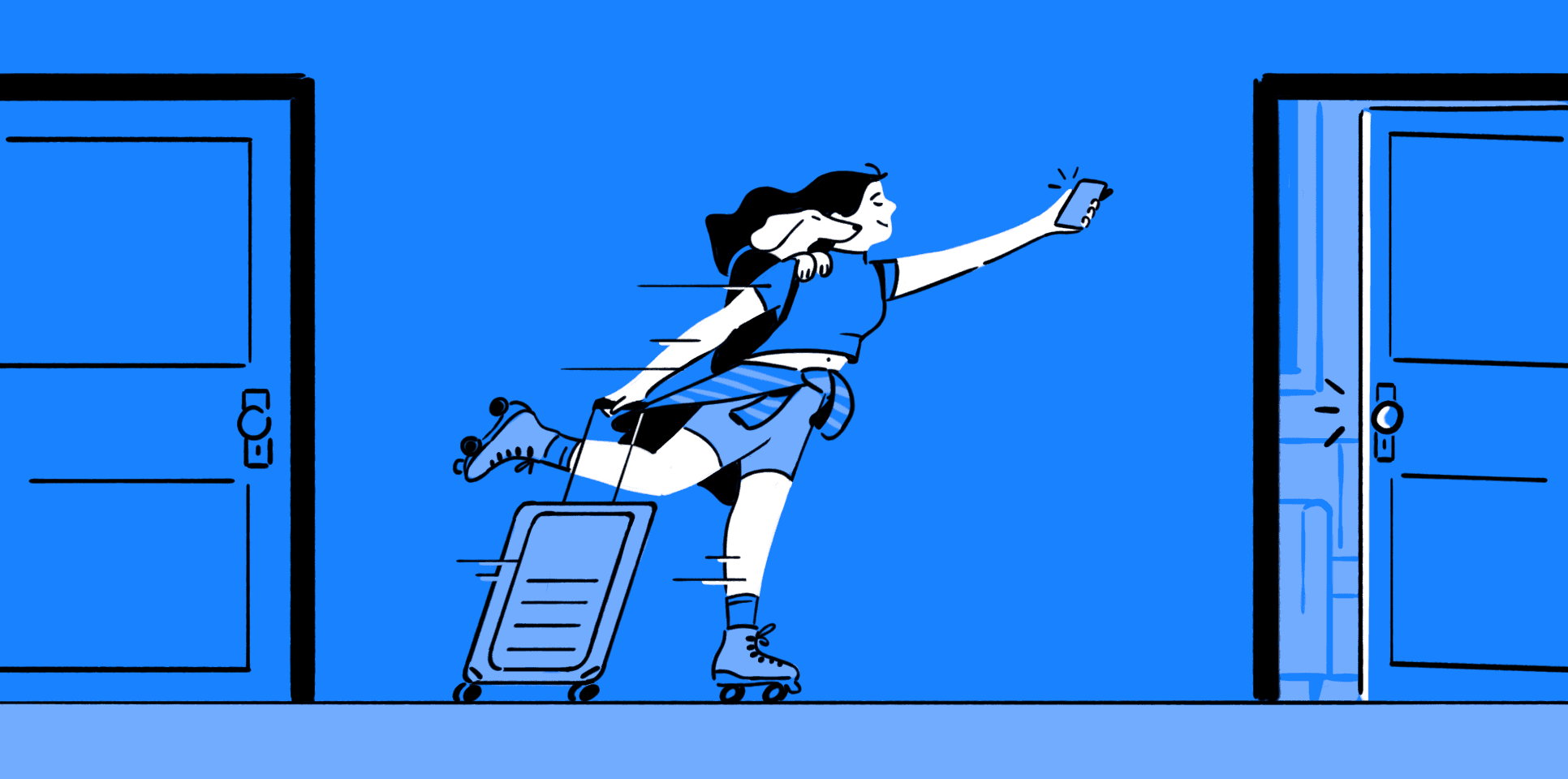

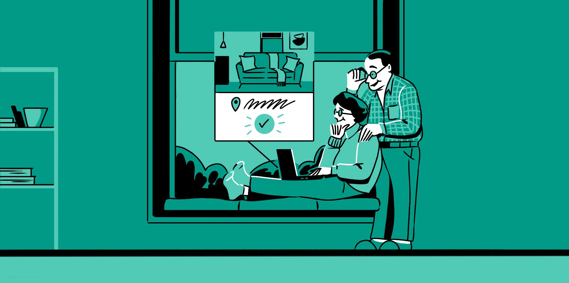




Building a Visual Universe for Modern Living
Case 01
Imagery that could have belonged to anyone, replaced by a lifestyle series in French comic linework.
See the full project→



The Shape of Learning
Case 02
Books, pencils, scissors and sharpeners, reduced to bold isometric shapes on a shared grid. An AI platform for K-12 where the AI stays a tool, not the hero.
See the full project→

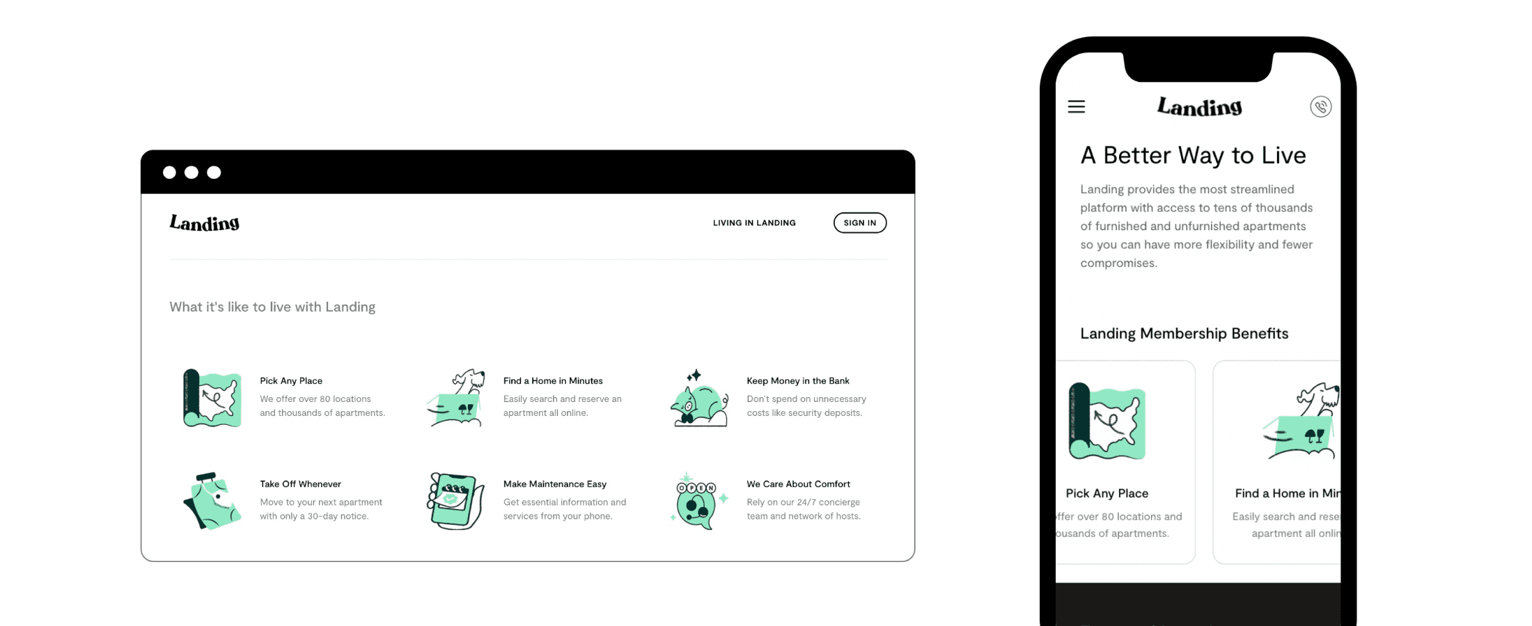


A new way to say Welcome Home
Case 03
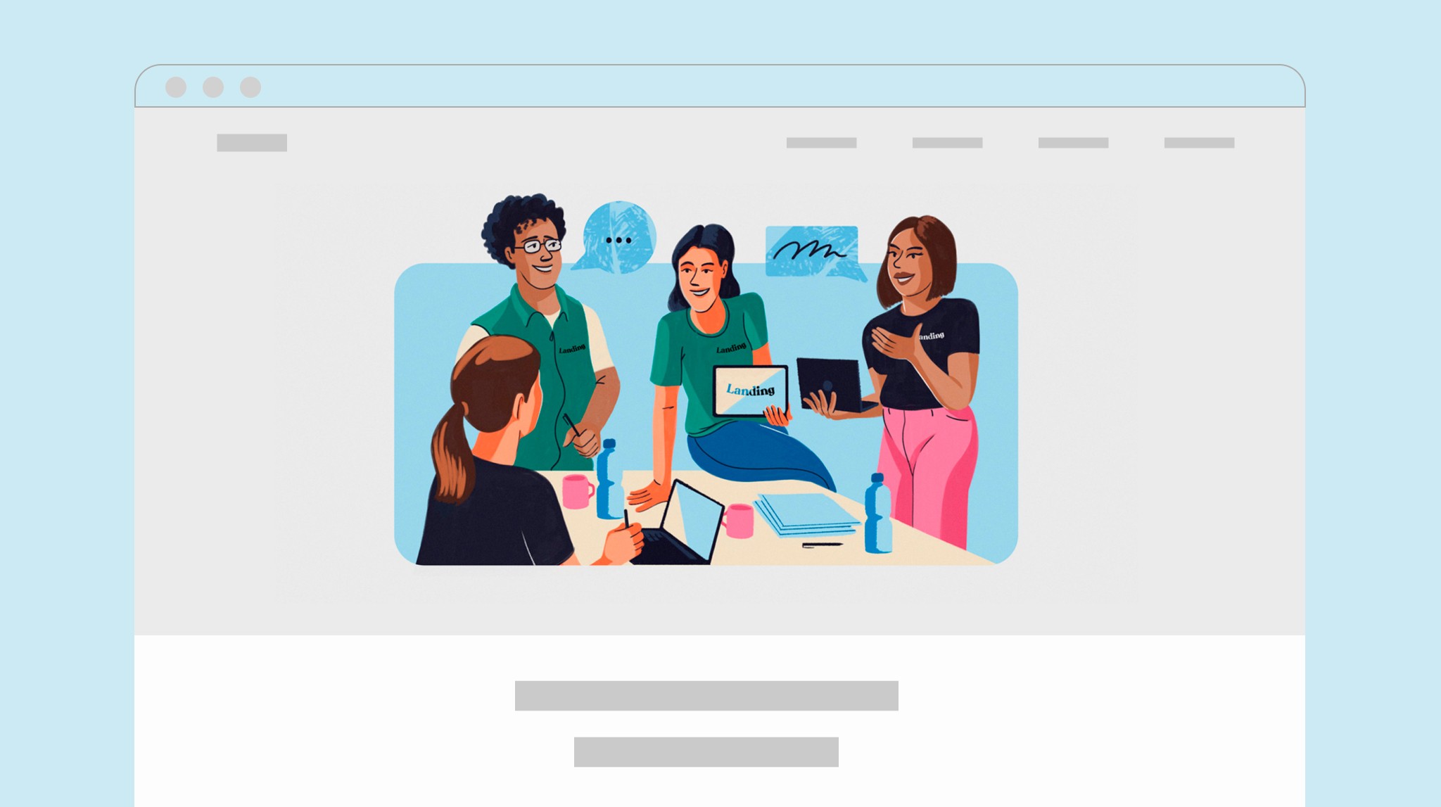
An icon system built with Landing's product team, delivered as a style guide they could keep building on.
See the full project→
How it works in practice
Brand worlds, built from drawing
Every identity here started as a pictogram and ended as a whole world.


Identity for a Wealth Platform
Case 04
A platform that guards what families build, given a symbol that guards too. Inside the key's teeth, a Z that was there all along: the Z works, the bird speaks.


Las Flores Restaurante
Case 05
Flowers pulled out of context, because what makes them interesting isn't their beauty but how they change with the seasons. An F monogram that shifts with the calendar, and the building's own architecture turned into pattern.


Visual System for Open Source Software
Case 06
A platform used by teams worldwide, with a visual language that had drifted. One icon system, one manual, one look, from the software interface to the trade show booth.
About
I'm Pablo, a visual designer and illustrator based in Barcelona with over 10 years of experience creating visual languages for brands.
I work with startups and growing brands to build distinctive identities through illustrated systems, campaign assets and design tools that evolve over time. Illustration, branding and animation, depending on what the brand needs.
I come from a background in communication and advertising, and moved into illustration and visual narrative through a scholarship from Gràffica magazine in Spain.
Illustration is more than decoration. It is a tool to create identity, explain ideas and build emotional connections. That is what makes a brand distinctive, human and memorable.
Where illustration works
Product & UI
Icons and illustration that make a product easier to understand.
Icon systems · Product illustration · Onboarding & empty states · UI spot illustration

Brand & campaign
The images that carry a brand: hero pieces, key visuals, campaign artwork.
Hero illustration · Brand illustration system · Campaign artwork · Key visuals

Content & editorial
Illustration that keeps content recognizable across every channel.
Article & blog illustration · Newsletters · Social · Editorial spots
Print & motion
Where the system leaves the screen, and where it moves.
Packaging · Printed goods · Merch · Motion & Lottie animation

Contact
Let's make something worth remembering.
Let's talk about what you're building.
A short call is usually enough to see if it's a fit.
pablodomrose@gmail.com
