


Las Flores Restaurante
client
Las Flores, Argentina
Sercices
Brand Identity, Logo Design, Icon Design, Illustration
Las Flores is a modern restaurant that weaves its recipes with flowers. The idea was to fuse the name with everyday elements, pulling flowers out of their natural context, since beyond their beauty, what makes them interesting is how they mutate through the seasons. Built on an F monogram, the identity carries an artisanal, lived-in feel, shifting with each season so the brand breathes. The restaurant's architecture became a pattern, echoed across every piece.


Identity for a Wealth Platform
client
Zite, zite.co
Sercices
Brand Identity, Logo Design, Motion Design
Zite is a wealth management platform for advisors and family offices. The concept: a bird guarding a key, a protector watching over what a family builds. Hidden in the key's teeth was the brand's own initial, a Z waiting to be found. That discovery became the primary mark, while the guardian stayed as the brand's expressive voice. One idea, two roles: the Z works, the bird speaks. Built as a system, each version knowing exactly where it belongs.


Visual System for Open Source Software
client
GLPI by Teclib
Sercices
Art Direction, Icon System, Motion Design, Brand Guidelines
GLPI by Teclib is an open source IT service management platform used by teams worldwide. I came in to put its visual language in order: organizing the brand manual, building a full icon system, animating pieces for web and social, and designing everything around the product, from stationery to event material and trade show stands. One consistent look across every touchpoint, from the software to the booth.




UI Illustrations for a Fintech
client
Paymennt, United Arab Emirates
Sercices
Art Direction, Visual Design, Product Illustration
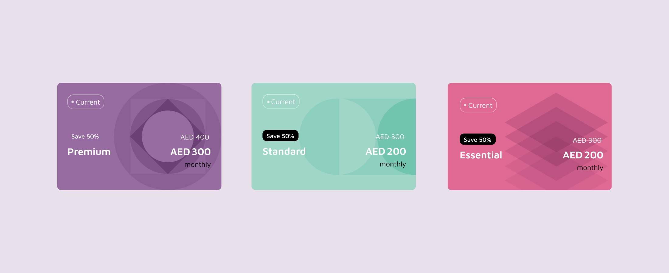
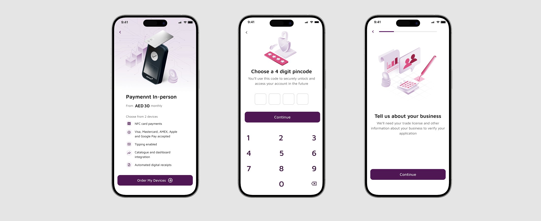
Paymennt is a Dubai-based fintech redesigning its app and website. They brought me on to rebuild their illustrations: a system of isometric pieces with gradients, built around a digital-first look for a 27 to 35 year old audience. I created product illustrations, icons and promotional graphics aligned with their financial products, focused on making complex financial concepts feel simple through clean, modern imagery.



Bringing Internet to faraway places
client
Agencia Capitaán
Sercices
Art direction, Branding, Visual Design
Glnet is a company that provides internet service to places of difficult access such as rural areas or valleys. It was a family business with aspirations to extend its territory to the region. Together with Agencia Capitan, we think of an identity that transmits the concept of simple and direct connectivity, for applications such as antennas or mobiles.



A place for original content
client
Iconosur
Sercices
Branding, Visual Design
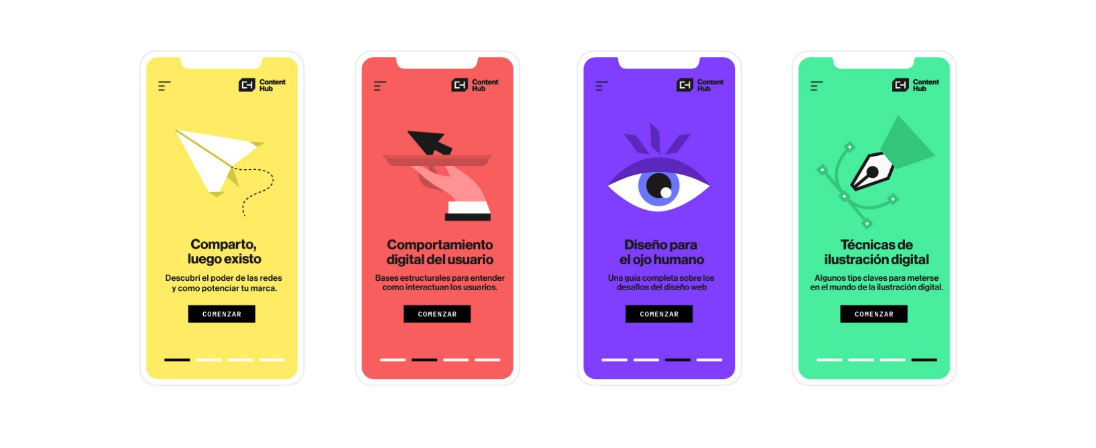
Content Hub is a digital medium with a collection of evergreen content. A hub gives the reader more freedom to find content that is valuable to him and to find the content they are looking for, faster. The idea was to generate a flexible brand, which contains a clear, minimalist language and that pursues technological trends, with vector shapes and full colors that can last over time.